More Matplotlib#
Matplotlib is the dominant plotting / visualization package in python. It is important to learn to use it well. In the last lecture, we saw some basic examples in the context of learning numpy. This week, we dive much deeper. The goal is to understand how matplotlib represents figures internally.
from matplotlib import pyplot as plt
%matplotlib inline
Figure and Axes#
The figure is the highest level of organization of matplotlib objects. If we want, we can create a figure explicitly.
fig = plt.figure()
<Figure size 640x480 with 0 Axes>
fig = plt.figure(figsize=(13, 5))
<Figure size 1300x500 with 0 Axes>
fig = plt.figure()
ax = fig.add_axes([0, 0, 1, 1])
fig = plt.figure()
ax = fig.add_axes([0, 0, 0.5, 1])
fig = plt.figure()
ax1 = fig.add_axes([0, 0, 0.5, 1])
ax2 = fig.add_axes([0.5, 0, 0.3, 0.5], facecolor='g')
Subplots#
Subplot syntax is one way to specify the creation of multiple axes.
fig = plt.figure()
axes = fig.subplots(nrows=2, ncols=3)
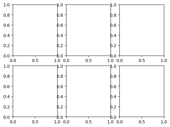
fig = plt.figure(figsize=(1, 1))
axes = fig.subplots(nrows=2, ncols=3)
axes
array([[<Axes: >, <Axes: >, <Axes: >],
       [<Axes: >, <Axes: >, <Axes: >]], dtype=object)
axes[0,0]
<Axes: >
There is a shorthand for doing this all at once.
This is our recommended way to create new figures!
fig, ax = plt.subplots()
ax
<Axes: >
fig, axes = plt.subplots(ncols=2, figsize=(8, 4), subplot_kw={'facecolor': 'g'})
axes
array([<Axes: >, <Axes: >], dtype=object)
Drawing into Axes#
All plots are drawn into axes. It is easiest to understand how matplotlib works if you use the object-oriented style.
# create some data to plot
import numpy as np
x = np.linspace(-np.pi, np.pi, 100)
y = np.cos(x)
z = np.sin(6*x)
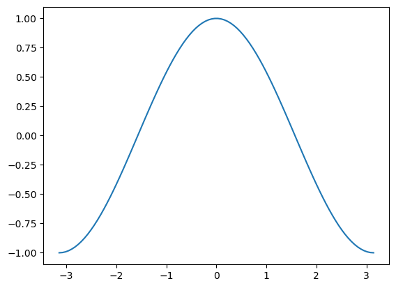
plt.plot(x,y)
[<matplotlib.lines.Line2D at 0x7aa095e08f50>]
fig, ax = plt.subplots()
plt.plot(x,y)
[<matplotlib.lines.Line2D at 0x7aa095bb19a0>]
ax
<Axes: >
ax.plot(x, y)
[<matplotlib.lines.Line2D at 0x7aa095bb3ef0>]
fig
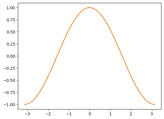
This does the same thing as
plt.plot(x, y)
[<matplotlib.lines.Line2D at 0x7aa095c23140>]
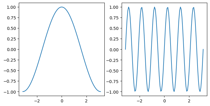
This starts to matter when we have multiple axes to worry about.
fig, axes = plt.subplots(figsize=(8, 4), ncols=2)
ax0, ax1 = axes
ax0.plot(x, y)
ax1.plot(x, z)
[<matplotlib.lines.Line2D at 0x7aa095c51ca0>]
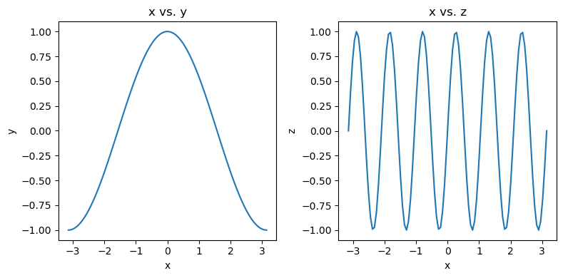
Labeling Plots#
fig, axes = plt.subplots(figsize=(8, 4), ncols=2)
ax0, ax1 = axes

ax0.plot(x, y)
ax0.set_xlabel('x')
ax0.set_ylabel('y')
ax0.set_title('x vs. y')

ax1.plot(x, z)
ax1.set_xlabel('x')
ax1.set_ylabel('z')
ax1.set_title('x vs. z')

# squeeze everything in
plt.tight_layout()
Customizing Line Plots#
fig, ax = plt.subplots()
ax.plot(x, y, x, z)
[<matplotlib.lines.Line2D at 0x7aa09e106240>,
 <matplotlib.lines.Line2D at 0x7aa09e107b60>]
fig, ax = plt.subplots()
ax.plot(x, y)
ax.plot(x, z)
[<matplotlib.lines.Line2D at 0x7aa09e075af0>]
fig, ax = plt.subplots()
ax.plot(x, z)
ax.plot(x, y)
[<matplotlib.lines.Line2D at 0x7aa09e1eca40>]
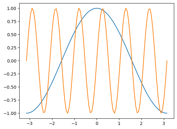
It’s simple to switch axes
fig, ax = plt.subplots()
ax.plot(y, x, z, x)
[<matplotlib.lines.Line2D at 0x7aa09e285f40>,
 <matplotlib.lines.Line2D at 0x7aa09e285a30>]
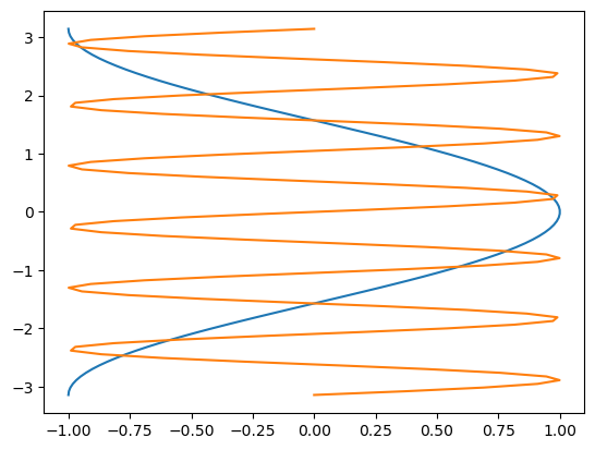
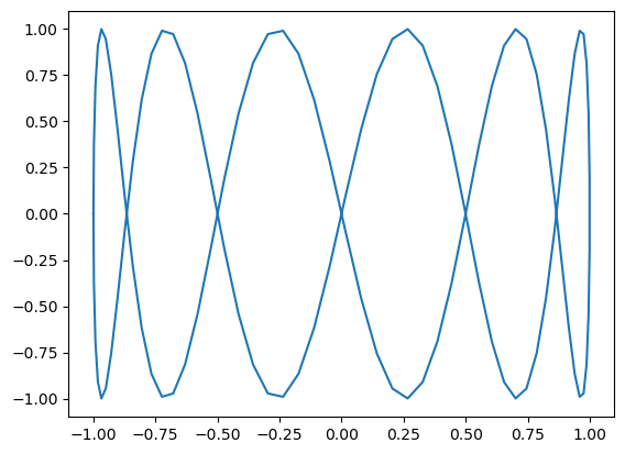
A “parametric” graph:
fig, ax = plt.subplots()
ax.plot(y, z)
[<matplotlib.lines.Line2D at 0x7aa0959cf080>]
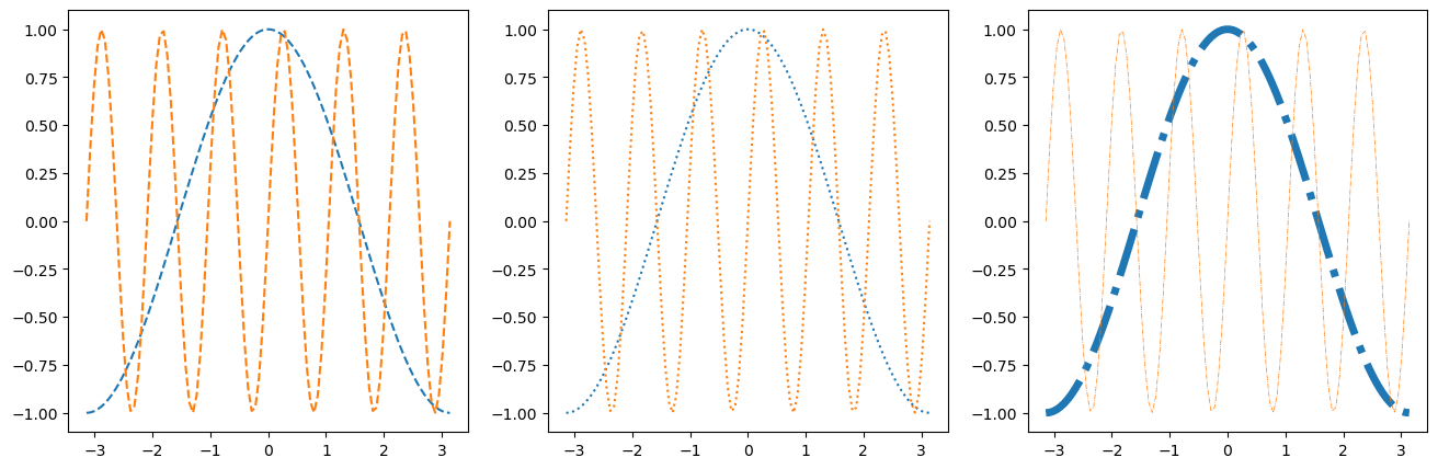
Line Styles#
fig, axes = plt.subplots(figsize=(16, 5), ncols=3)
axes[0].plot(x, y, linestyle='dashed')
axes[0].plot(x, z, linestyle='--')

axes[1].plot(x, y, linestyle='dotted')
axes[1].plot(x, z, linestyle=':')

axes[2].plot(x, y, linestyle='dashdot', linewidth=5)
axes[2].plot(x, z, linestyle='-.', linewidth=0.5)
[<matplotlib.lines.Line2D at 0x7aa0958d4050>]
Colors#
As described in the colors documentation, there are some special codes for commonly used colors:
b: blue
g: green
r: red
c: cyan
m: magenta
y: yellow
k: black
w: white
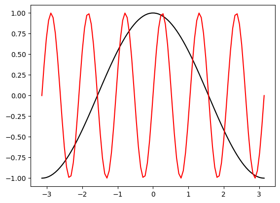
fig, ax = plt.subplots()
ax.plot(x, y, color='k')
ax.plot(x, z, color='r')
[<matplotlib.lines.Line2D at 0x7aa0954c1130>]
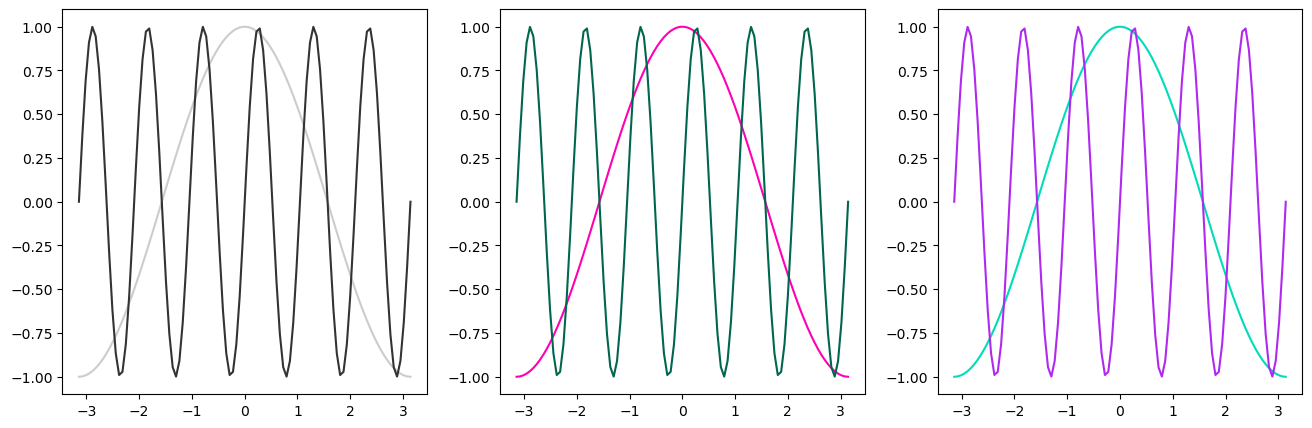
Other ways to specify colors:
fig, axes = plt.subplots(figsize=(16, 5), ncols=3)

# grayscale
axes[0].plot(x, y, color='0.8')
axes[0].plot(x, z, color='0.2')

# RGB tuple
axes[1].plot(x, y, color=(1, 0, 0.7))
axes[1].plot(x, z, color=(0, 0.4, 0.3))

# HTML hex code
axes[2].plot(x, y, color='#00dcba')
axes[2].plot(x, z, color='#b029ee')
[<matplotlib.lines.Line2D at 0x7aa0957a5e50>]
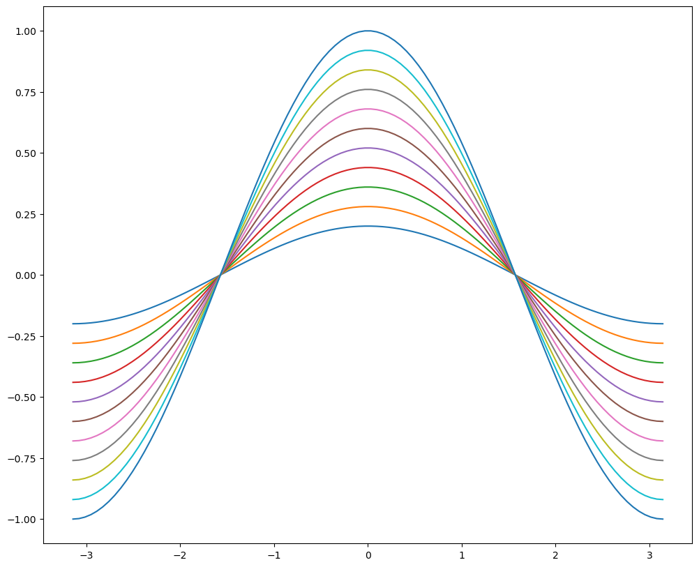
There is a default color cycle built into matplotlib.
plt.rcParams['axes.prop_cycle']
| 'color' |
|---|
| '#1f77b4' |
| '#ff7f0e' |
| '#2ca02c' |
| '#d62728' |
| '#9467bd' |
| '#8c564b' |
| '#e377c2' |
| '#7f7f7f' |
| '#bcbd22' |
| '#17becf' |
fig, ax = plt.subplots(figsize=(12, 10))
for factor in np.linspace(0.2, 1, 11):
    ax.plot(x, factor*y)
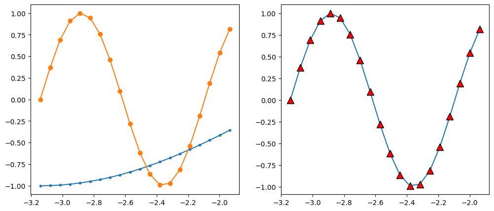
Markers#
There are lots of different markers availabile in matplotlib!
fig, axes = plt.subplots(figsize=(12, 5), ncols=2)

axes[0].plot(x[:20], y[:20], marker='.')
axes[0].plot(x[:20], z[:20], marker='o')

axes[1].plot(x[:20], z[:20], marker='^',
             markersize=10, markerfacecolor='r',
             markeredgecolor='k')
[<matplotlib.lines.Line2D at 0x7aa095761100>]
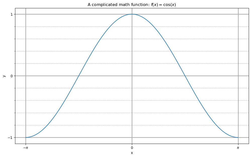
Label, Ticks, and Gridlines#
fig, ax = plt.subplots(figsize=(12, 7))
ax.plot(x, y)

ax.set_xlabel('x')
ax.set_ylabel('y')
ax.set_title(r'A complicated math function: $f(x) = \cos(x)$')

ax.set_xticks(np.pi * np.array([-1, 0, 1]))
ax.set_xticklabels([r'$-\pi$', '0', r'$\pi$'])
ax.set_yticks([-1, 0, 1])

ax.set_yticks(np.arange(-1, 1.1, 0.2), minor=True)
#ax.set_xticks(np.arange(-3, 3.1, 0.2), minor=True)

ax.grid(which='minor', linestyle='--')
ax.grid(which='major', linewidth=2)
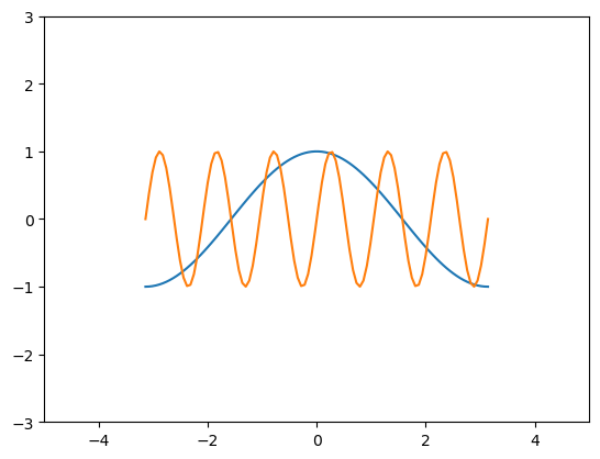
Axis Limits#
fig, ax = plt.subplots()
ax.plot(x, y, x, z)
ax.set_xlim(-5, 5)
ax.set_ylim(-3, 3)
(-3.0, 3.0)
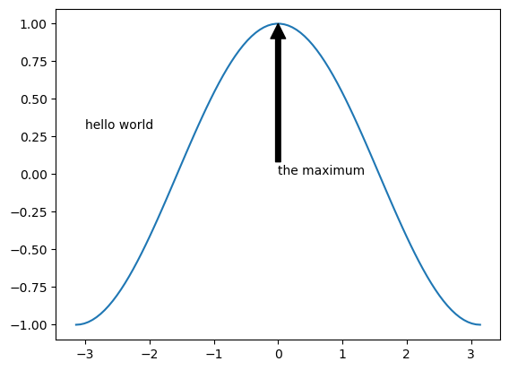
Text Annotations#
fig, ax = plt.subplots()
ax.plot(x, y)
ax.text(-3, 0.3, 'hello world')
ax.annotate('the maximum', xy=(0, 1),
             xytext=(0, 0), arrowprops={'facecolor': 'k'})
Text(0, 0, 'the maximum')
Other 1D Plots#
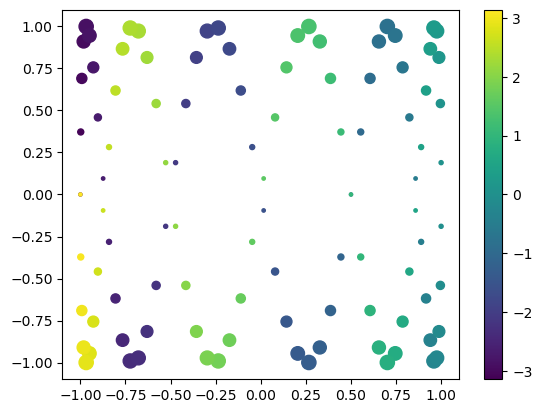
Scatter Plots#
fig, ax = plt.subplots()

splot = ax.scatter(y, z, c=x, s=(100*z**2 + 5))
fig.colorbar(splot)
<matplotlib.colorbar.Colorbar at 0x7aa095ac8ef0>
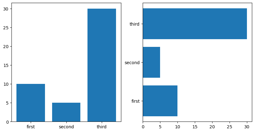
Bar Plots#
labels = ['first', 'second', 'third']
values = [10, 5, 30]

fig, axes = plt.subplots(figsize=(10, 5), ncols=2)
axes[0].bar(labels, values)
axes[1].barh(labels, values)
<BarContainer object of 3 artists>
2D Plotting Methods#
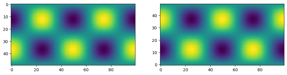
imshow#
x1d = np.linspace(-2*np.pi, 2*np.pi, 100)
y1d = np.linspace(-np.pi, np.pi, 50)
xx, yy = np.meshgrid(x1d, y1d)
f = np.cos(xx) * np.sin(yy)
print(f.shape)
(50, 100)
fig, ax = plt.subplots(figsize=(12,4), ncols=2)
ax[0].imshow(f)
ax[1].imshow(f, origin='lower')
<matplotlib.image.AxesImage at 0x7aa095763d40>
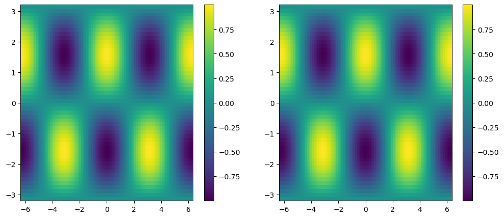
pcolormesh#
fig, ax = plt.subplots(ncols=2, figsize=(12, 5))
pc0 = ax[0].pcolormesh(x1d, y1d, f)
pc1 = ax[1].pcolormesh(xx, yy, f)
fig.colorbar(pc0, ax=ax[0])
fig.colorbar(pc1, ax=ax[1])
<matplotlib.colorbar.Colorbar at 0x7aa09436bb00>
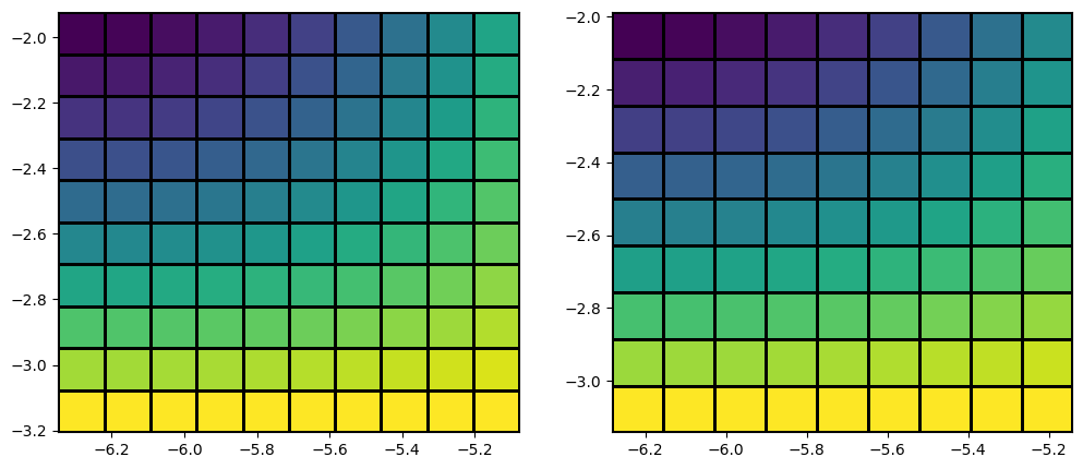
x_sm, y_sm, f_sm = xx[:10, :10], yy[:10, :10], f[:10, :10]

fig, ax = plt.subplots(figsize=(12,5), ncols=2)

# last row and column ignored!
ax[0].pcolormesh(x_sm, y_sm, f_sm, edgecolors='k')

# same!
ax[1].pcolormesh(x_sm, y_sm, f_sm[:-1, :-1], edgecolors='k')
<matplotlib.collections.QuadMesh at 0x7aa08f70ef90>
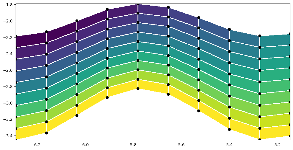
y_distorted = y_sm*(1 + 0.1*np.cos(6*x_sm))

plt.figure(figsize=(12,6))
plt.pcolormesh(x_sm, y_distorted, f_sm[:-1, :-1], edgecolors='w')
plt.scatter(x_sm, y_distorted, c='k')
<matplotlib.collections.PathCollection at 0x7aa095e55430>
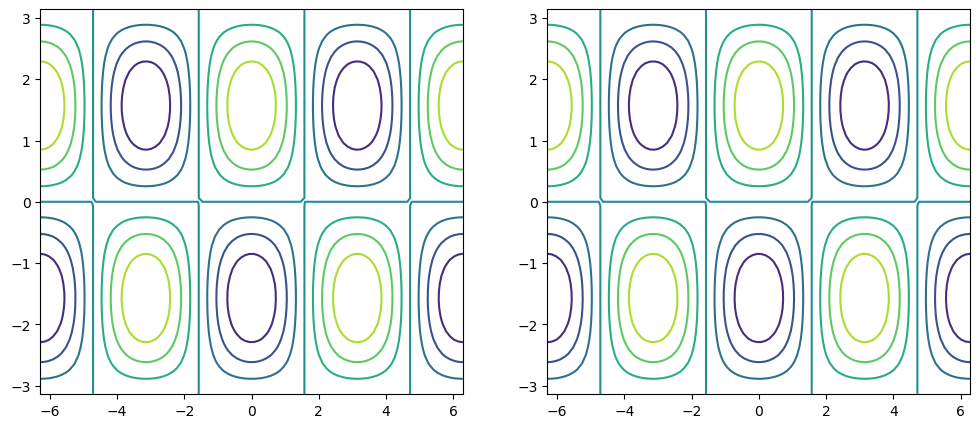
contour / contourf#
fig, ax = plt.subplots(figsize=(12, 5), ncols=2)

# same thing!
ax[0].contour(x1d, y1d, f)
ax[1].contour(xx, yy, f)
<matplotlib.contour.QuadContourSet at 0x7aa08f65c290>
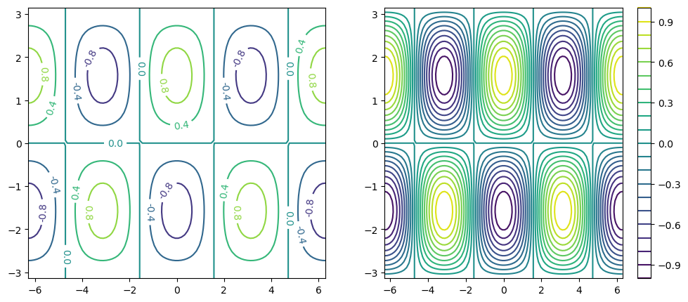
fig, ax = plt.subplots(figsize=(12, 5), ncols=2)

c0 = ax[0].contour(xx, yy, f, 5)
c1 = ax[1].contour(xx, yy, f, 20)

plt.clabel(c0, fmt='%2.1f')
plt.colorbar(c1, ax=ax[1])
<matplotlib.colorbar.Colorbar at 0x7aa08f53ddc0>
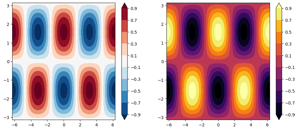
fig, ax = plt.subplots(figsize=(12, 5), ncols=2)

clevels = np.arange(-1, 1, 0.2) + 0.1

cf0 = ax[0].contourf(xx, yy, f, clevels, cmap='RdBu_r', extend='both')
cf1 = ax[1].contourf(xx, yy, f, clevels, cmap='inferno', extend='both')

fig.colorbar(cf0, ax=ax[0])
fig.colorbar(cf1, ax=ax[1])
plt.savefig('test_fig.png')
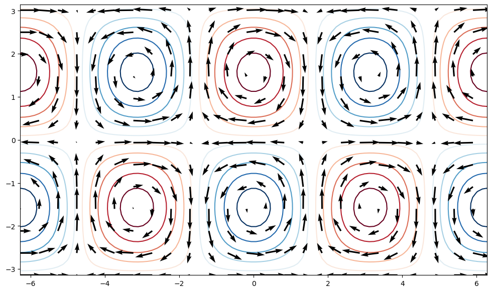
quiver#
u = -np.cos(xx) * np.cos(yy)
v = -np.sin(xx) * np.sin(yy)

fig, ax = plt.subplots(figsize=(12, 7))
ax.contour(xx, yy, f, clevels, cmap='RdBu_r', extend='both', zorder=0)
ax.quiver(xx[::4, ::4], yy[::4, ::4],
           u[::4, ::4], v[::4, ::4], zorder=1)
<matplotlib.quiver.Quiver at 0x7aa08f399370>
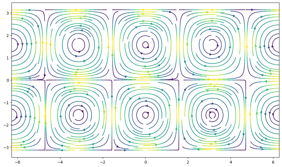
streamplot#
fig, ax = plt.subplots(figsize=(12, 7))
ax.streamplot(xx, yy, u, v, density=2, color=(u**2 + v**2))
<matplotlib.streamplot.StreamplotSet at 0x7aa08f399eb0>