
Assignment 4b: More Matplotlib#
At-home assignment — worth 10 points. When you’re done, push your work to your week folder and post a link to your completed notebook on the matching Courseworks assignment.
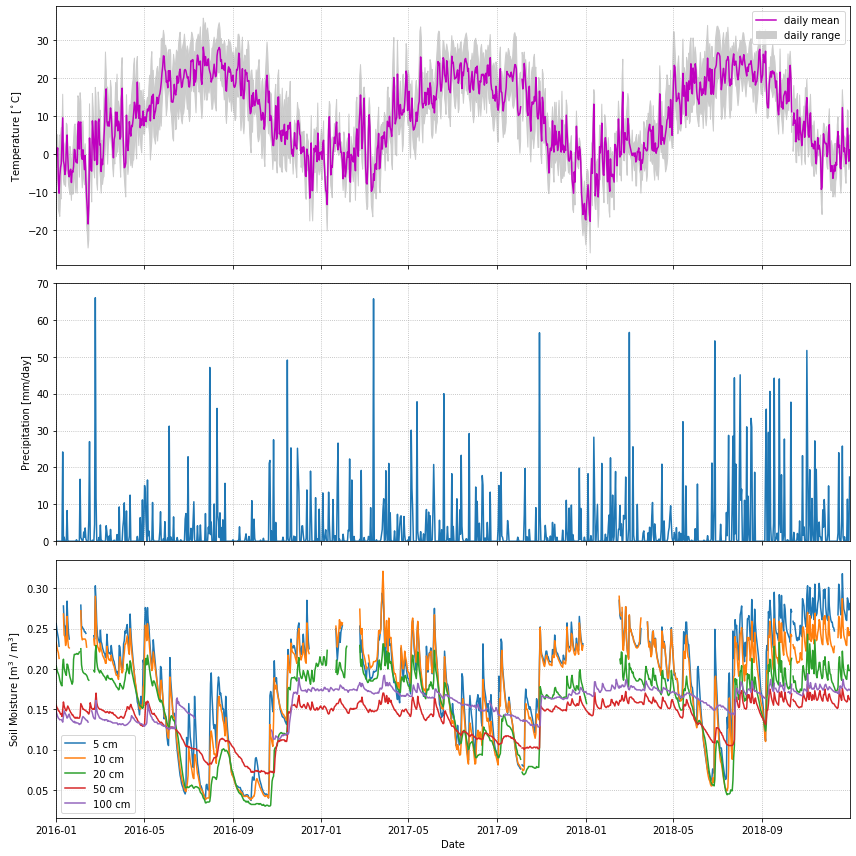
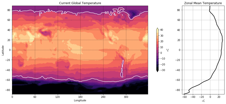
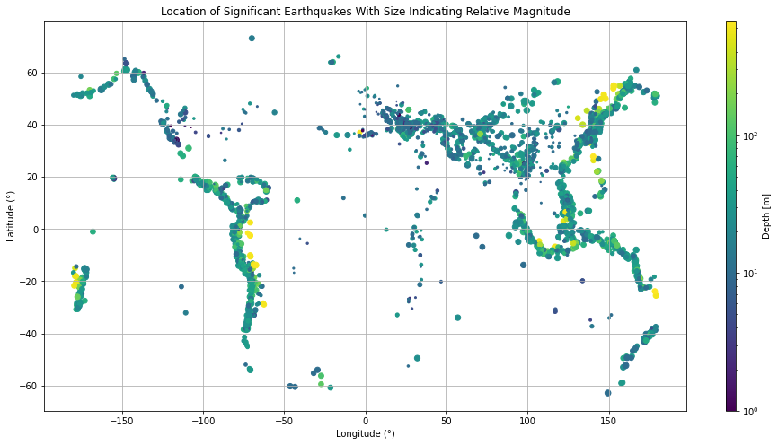
The goal here is to replicate the figures you see as closely as possible, using only numpy and matplotlib.
Learning goals
This assignment exercises matplotlib customization skills from this section:
Build figures with the explicit Figure / Axes (
fig, ax = plt.subplots(...)) patternCustomize line styles, colors, markers, and legends
Use
contourfand colorbars to visualize 2D scalar dataUse scatter plots with color and size to encode multiple variables on a 2D plane
Working through this notebook
Download this notebook using the ⬇ button in the top-right (or copy-paste the cells into a fresh notebook), open it in your environment (JupyterLab on LEAP or Colab), and fill in your solution under each problem.
For each problem, the cell below the problem statement downloads / prepares the data into numpy arrays. Don’t worry about how that code works — just run it and use the resulting arrays in your plots. You are not allowed to use any packages other than numpy and matplotlib.
When you’re done, follow the submission instructions at the bottom of the page.
Problem 1: Line plots#
In this problem, we will plot some daily weather data from a NOAA station in Millbrook, NY. A full description of this dataset is available at: https://www.ncdc.noaa.gov/data-access/land-based-station-data
The cell below uses pandas to download the data and populate a bunch of numpy arrays (t_daily_min, t_daily_max, etc.) Run the cell and then use the numpy arrays to try to re-create the plot you see.
import pooch
POOCH = pooch.create(
    path=pooch.os_cache("noaa-data"),
    # Use the figshare DOI
    base_url="doi:10.5281/zenodo.5553029/",
    registry={
        "HEADERS.txt": "md5:2a306ca225fe3ccb72a98953ded2f536",
        "CRND0103-2016-NY_Millbrook_3_W.txt": "md5:eb69811d14d0573ffa69f70dd9c768d9",
        "CRND0103-2017-NY_Millbrook_3_W.txt": "md5:b911da727ba1bdf26a34a775f25d1088",
        "CRND0103-2018-NY_Millbrook_3_W.txt": "md5:5b61bc687261596eba83801d7080dc56",
        "CRND0103-2019-NY_Millbrook_3_W.txt": "md5:9b814430612cd8a770b72020ca4f2b7d",
        "CRND0103-2020-NY_Millbrook_3_W.txt": "md5:cd8de6d5445024ce35fcaafa9b0e7b64"
    },
)


import pandas as pd

with open(POOCH.fetch("HEADERS.txt")) as fp:
    data = fp.read()
lines = data.split('\n')
headers = lines[1].split(' ')

dframes = []
for year in range(2016, 2019):
    fname = f'CRND0103-{year}-NY_Millbrook_3_W.txt'
    df = pd.read_csv(POOCH.fetch(fname), parse_dates=[1],
                     names=headers, header=None, sep=r'\s+',
                     na_values=[-9999.0, -99.0])
    dframes.append(df)

df = pd.concat(dframes)
df = df.set_index('LST_DATE')
df

#########################################################
#### BELOW ARE THE VARIABLES YOU SHOULD USE IN THE PLOTS!
#### (numpy arrays)
#### NO PANDAS ALLOWED!
#########################################################

t_daily_min = df.T_DAILY_MIN.values
t_daily_max = df.T_DAILY_MAX.values
t_daily_mean = df.T_DAILY_MEAN.values
p_daily_calc = df.P_DAILY_CALC.values
soil_moisture_5 = df.SOIL_MOISTURE_5_DAILY.values
soil_moisture_10 = df.SOIL_MOISTURE_10_DAILY.values
soil_moisture_20 = df.SOIL_MOISTURE_20_DAILY.values
soil_moisture_50 = df.SOIL_MOISTURE_50_DAILY.values
soil_moisture_100 = df.SOIL_MOISTURE_100_DAILY.values
date = df.index.values
units = lines[2].split(' ')
for name, unit in zip(headers, units):
    print(f'{name}: {unit}')
Problem 2: Contour Plots#
Now we will visualize some global temperature data from the NCEP-NCAR atmospheric reanalysis.
import xarray as xr
ds_url = 'http://iridl.ldeo.columbia.edu/SOURCES/.NOAA/.NCEP-NCAR/.CDAS-1/.MONTHLY/.Diagnostic/.surface/.temp/dods'
ds = xr.open_dataset(ds_url, decode_times=False)

#########################################################
#### BELOW ARE THE VARIABLES YOU SHOULD USE IN THE PLOTS!
#### (numpy arrays)
#### NO XARRAY ALLOWED!
#########################################################

temp = ds.temp[-1].values - 273.15
lon = ds.X.values
lat = ds.Y.values
Problem 3: Scatter plots#
Here we will make a map plot of earthquakes from a USGS catalog of historic large earthquakes. Color the earthquakes by log10(depth) and adjust the marker size to be magnitude\(^4\)/100
import numpy as np
fname = pooch.retrieve(
    "https://rabernat.github.io/research_computing/signif.txt.tsv.zip",
    known_hash='22b9f7045bf90fb99e14b95b24c81da3c52a0b4c79acf95d72fbe3a257001dbb',
    processor=pooch.Unzip()
)[0]

earthquakes = np.genfromtxt(fname, delimiter='\t')
depth = earthquakes[:, 8]
magnitude = earthquakes[:, 9]
latitude = earthquakes[:, 20]
longitude = earthquakes[:, 21]
earthquakes
Submission instructions#
When you’re done, save your completed notebook as assignment4b.ipynb inside the current week’s folder in your private clmt5405-assignments GitHub repo. Then push the commit:
git add <weekN>/assignment4b.ipynb
git commit -m "Submit assignment 4b"
git push
Due Sunday night.